
Think Mobile First
Posted on by
As mobile devices became more prominent over the past few years, one of the mantras we hear from web designers is "Mobile First." This makes sense, not only from a designer's perspective, but more importantly, it works because as content producers we think about our content first and decide what is most important.
We encourage you to prepare your content sequentially. Put the important bits at the top and the less critical bits at the bottom. That is how it will be viewed on mobile devices. Here is an example:

If you were writing a book you would naturally think of beginning, middle and ending. Why should a web page be any different?
Every post or page in WordPress has some essential content specific to that post or page. That goes in the middle, the Content area. Now decide what other bits should come before that content and what should follow.
The greyed areas are the header and footer areas. These will always be at the top and bottom, respectively. The white areas comprise the overall content areas and these will restructure when your page is viewed on larger devices: tablet, laptop and desktop.
Here is the same page displayed on a medium sized screen, such as a tablet:
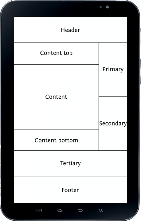
On this screen there is room for a sidebar, so the content from the Primary and Secondary areas move in a sidebar. In this image the sidebar is on the right. It could be on the left instead.
Finally, here the same content displayed on a laptop or desktop:
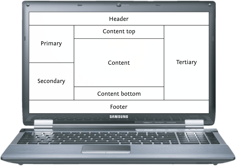
Because there is more space to work with horizontally, there can now be two sidebars if you want. In this image we show one on each side. They could both be on the left or the right. Or if you prefer to stick with a single sidebar on larger screens, the layout can be the same as we showed above for medium sized screens.
While we support seven areas in addition to the main Content area, you only use what you need. If an area is empty, nothing will display and your layout automatically adjusts to accommodate.
What is important is to think about your content sequentially. Seems natural, right? This not only helps to organize your thoughts, but makes your layout decisions simple. You can make it look good on small, medium and large screens.
As mobile devices became more prominent over the past few years, one of the mantras we hear from web designers is "Mobile First." This makes sense, not only from a designer's perspective, but more importantly, it works because as content producers we think about our content first and decide what is most important.
We encourage you to prepare your content sequentially. Put the important bits at the top and the less critical bits at the bottom. That is how it will be viewed on mobile devices. Here is an example:
If you were writing a book you would naturally think of beginning, middle and ending. Why should a web page be any different?
Every post or page in WordPress has some essential content specific to that post or page. That goes in the middle, the Content area. Now decide what other bits should come before that content and what should follow.
The greyed areas are the header and footer areas. These will always be at the top and bottom, respectively. The white areas comprise the overall content areas and these will restructure when your page is viewed on larger devices: tablet, laptop and desktop.
Here is the same page displayed on a medium sized screen, such as a tablet:
On this screen there is room for a sidebar, so the content from the Primary and Secondary areas move in a sidebar. In this image the sidebar is on the right. It could be on the left instead.
Finally, here the same content displayed on a laptop or desktop:
Because there is more space to work with horizontally, there can now be two sidebars if you want. In this image we show one on each side. They could both be on the left or the right. Or if you prefer to stick with a single sidebar on larger screens, the layout can be the same as we showed above for medium sized screens.
While we support seven areas in addition to the main Content area, you only use what you need. If an area is empty, nothing will display and your layout automatically adjusts to accommodate.
What is important is to think about your content sequentially. Seems natural, right? This not only helps to organize your thoughts, but makes your layout decisions simple. You can make it look good on small, medium and large screens.